Quote:
Originally Posted by deepdvr

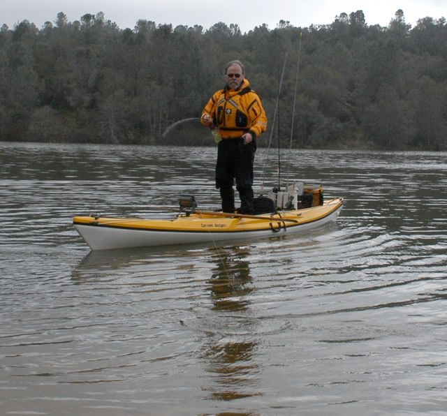
This pic is the NorCal dude that almost got chomped this past August. So much for the shark shield pattern on the yak.
 |
This is the classic example of someone taking an idea they do not understand and using it in a way that it actually achieves the opposite effect of what they are going for.
The idea behind the concept that patterns would deter sharks is that a pattern breaks up the silhouette of the object involved, minimizing it's contrast with the surrounding environment like camouflage. From that basic concept some people took that all patterns deter sharks and started painting zebra stripes on their surfboards. Now those black zebra stripes on white surfboards are not a terrible idea as they make some sense because in the water the white turns to light blue and the black to dark blue and to the shark that looks like rippling surface water, but the stripes really should go all the way to the edge for them to be effective.
This guy took the zebra stripes and went a step further, and painted high contrast black bars on his Yum Yum yellow yak.
In order to break up the silhouette first the pattern needs to go all the way to the edges and second it part of the pattern has to blend in to the environment the yak is in. His pattern does neither. It instead looks like some high contrast road side sign, that's there to alert a driver to danger.
Don't paint that pattern on your kayak.


Warning signs are yellow and black for a reason it's to make them stand out and be more visible to the eye. His stripes rather then make his kayak less visible to sharks just make it more visible and therefore more interesting to sharks. So essentially his stripes made it even more attractive to sharks, which might well be a factor in why it was attacked.
Once again it's the Yum Yum yellow factor.
Like I said sharks are attracted by bright colors, and contrast and though bright colors may not be as likely to trigger a hunting type of attack from a deep shark they are far more likely to trigger investigative behavior or scavenging behavior where a shark that is already swimming near the surface comes up and chews on your yak, just to see if it's something edible. Sharks are opportunistic and will eat other things that they do not hunt down. Just like a good looking babe draws your attention when walking by that high contrast pattern on that yak caught that sharks eye and made it worthy of investigation.
This may seem wild or new but it's not. People have been fishing small boats in the ocean for thousands of years and it's always been traditional to paint hulls white aqua or blue. I bet you money that centuries ago local fisherman in shark infested waters figured out that white or blue hulls were less attractive to sharks then bright colored ones and that is why that tradition exists.
Before rotomolded kayaks most commercially available kayaks had white hulls. For instance I bought a Altura Kevlar yak that I'm going to put a hobie drive into. It's yellow and a non traditional shape but it has a traditional white hull like all their traditional touring yaks
That is actually the very kayak I now own, nice but I'll probably eventually camo that bottom as well.
As to your stripe guy...If he wanted to make his yellow yak less interesting to sharks all he had to do is paint the bottom white or blue. The last thing he should of done is put high contrast stripes on it because that's like a high contrast invitation for trouble.
Just my take...
Jim